Thursday, 13 May 2010
Thursday, 22 April 2010


Friday, 26 March 2010
Evaluation
My brief was to create a promotion package for the release of a new album, which was to include a music promo video with two ancillary texts which are a cover for the release of the Digi pack with a CD/DVD cover and magazine advertisement for the Digi pack/CD/DVD.
To get a better idea of the forms and conventions for my music video I looked at some music videos with the same genre of music to mine. I looked at the mise-en-scene, editing and what audiences they attracted. The genre I chose for my music video was dance because a lot of my target audience listen to this genre of music also its my favourite genre. I focused on this at the beginning so that half way through my research and planning wouldn’t look like it was not fit together.
Before I started filming I carried out some research on the conventions of a music video. I analysed four music videos which were either similar to how I wanted my music video or of the same genre as my music video. They are all on my blog via a you tube embedded link. I also added the video directors name, date released and music company of each researched music video with the same genre as mine. The feedback I received will be very reliable as the videos will have been seen by a very wide range of audiences. I used LIIAR to analyse the music videos I researched. I did the majority of my research over the internet but some research with my questionnaires. I discovered my target audience with the results of the questionnaires which I gave out to ten females and ten males to make the research even, the results made my target audience as Young Adults. Once I had chosen my genre and found my target audience I made the results into pie charts so that they were clearer to see instead of going through all the questionnaires. I did research on my chosen artist and song so I could get better idea of the other types f music he has produced. I am going to give my audience what they want by using my target audience in my video.
When I analysed the music video I had made sure I talked about any editing which was done and the institution about the video.
I had the choice to choose which ancillary texts I wanted to produce but I chose to do a Digipack and a magazine advertisement. I had to do planning, research and developments of my chosen text which are all shown on my blog.
In my AS coursework I did use some editing suite facilities unlike the A2 students at wyke this year as I didn’t come to wyke college on my first year of A level studies, I had to create a thriller which lasted two minutes and add my own editing. I was in a group of 3 which meant we had to share the editing between us fairly however we still all had to have separate paper work and evaluations. In my A2 year at Wyke I had to use a blogger website to display all my work onto which I had never used before unlike the other A2 students at wyke. At Driffield sixth form I had to display my work on Microsoft slide shower but I prefer the blogger a lot more, it is practical and much easier to use. In my first year I didn’t have to do any extra research on past thrillers so I had extra time to edit the video unlike this year.
Before I started filming I had to do lots of planning such as, health & safety, location, prop list, characters and test shots & scripting. I made some small tables on Microsoft Excel to hand out to my cast so they would know when and where we were meting on arranged times and dates, this made it a lot easier and organised for me as the music video director. The technology I had to use made me more confident before even editing my video clip. After I had finished filming my music video I had to uploads the clips I filmed onto Adobe Premiere Pro which is an editing programme in which you can crop and put effects onto your filming. I uploaded my clips by using a Fire wire connected from the camera through to the USB in the editing suite computer. We had to evaluate and analyse our chosen music videos to research genre, we did this using you tube and embedding the URL onto our blogs so when people looked our blogs they could see the video as well as reading the analysis.
I used my Blackberry mobile phone to take pictures for testing shots because it has a 5 mega pixel camera and didn’t want to use the video camera to take still videos to change into pictures when uploaded onto the editing suite. I uploaded the pictures I took from my phone using a USB Bluetooth dongle. I designed my CD cover using Paint so it was easier to move images around compared to other programmes.
I think I met audience expectation because I chose a very well known song for my music video so people would already expect an upbeat music video to go with the song. I got ideas for my video through the lyrics for example, “its my life and i’m living it now”. Also Tom Sapp influence y music video a lot due to his photography. He did a lot of beach scenes of children, family’s and young adults. Fort Fisher is one of Tom's favourite places to photograph family portraits and wedding events. The Shoreline Oak trees, rocks and structures across from the Fort Fisher Museum render a verity of fun environments for portrait backgrounds. This immediately chose my location a beach because of his influential photography. I did not want to have any still photos in my music video due to my song been a very upbeat and fast tempo. I chose my cast carefully otherwise my video wouldn’t have look as effective as it does. I chose James Cooper to be in my music video because he was the perfect image for my target audience. It would have been also easy to change his "look" if I wanted to by a change of clothes/ hair style ect. He always turned up on time which I knew he would and was a very reliable source for the video. I chose Amanda Croft to feature in my music video because she was also like James Cooper a perfect image towards my target audience. Because Amanda was 18 it was the same as my target audience I also knew that Amanda would not let me down when I planned for us to shoot and she always turned up the correct clothes I asked her to be in. Amanda was an iconic representation of beauty because she had blonde hair and blue eyes which reflected in my music video when all finished. At the beginning of planning my video ideas and story board I tried to be as creative as I could. Originally I wanted to have all my music video in black and white so it would look modern but then I decided against it as when I started editing the special effects I added to my clips didn’t look as effective in black and white. When I made my final decision to film my music video on a beach at first I did have some doubts as to my cast being able to get to Bridlington and when we could all met up to film. I had to choose my location very carefully. In the end I chose Bridlington beach because I knew that in the days during the week when I was filming it wouldn’t be as busy compared to a weekend also if I chose a more commercial place such as Scarborough it would have been too busy to film on the beach during the day and even on the night as well. I wanted to create a happy/fun mood with my video and the lighting made this clearly possible. It was a bright day the second time I filmed so it made this happy/fun mood makeable. All the shots were taken on Bridlington beach.
I didn’t want to use voyeuristic pleasure in my music video because I didn’t want my characters/artists singing or miming anything in the music video and would rather have a video which has so narrative structure because my audience research showed that that was the most liked type of music video. I wanted my music video to be a bit like a short film but with no narrative structure to it.
I used all the usual music video conventions for example, Lyrics normally create a general feeling/mood/ sense of subjects rather then meaning, Music tempo influences the editing, Genre can be reflected in types of mise-en-scene/themes/camera or editing style. has own music style/iconography
Camera, makes the meaning obvious. The Angle and shot distance all play a part in the representation of the artist/band, Editing fast cutting montage it normally most popular also depending on genre but can fit more action into the video when using this technique. Making many of the images impossible to grasp on first viewing, so ensuring numerous viewing. This offers different kinds of pleasure for the audience. (Voyeuristic pleasure)
We had to produce another two ancillary texts which was a CD cover and a magazine to sell the CD cover. The main convention I used for my CD cover was still a beach theme the same as my music video. I thought the font I used on my CD front cover was important as it stand out a lot compared to the back drop of the cover. I used a posh/fancy style of font because any other style of font wouldn’t have look right because of the background of the cover also my chosen style of font would be more eye catching in a music store such as HMV as all the CDs would be placed alphabetically. I didn’t want to have Armand Van Helden on my CD front cover but I wanted to do something more original and different so it was linked to my music video. Genres such as R & B rely on voyeuristic pleasure to sometimes sell their albums and I didn’t want my CD cover to come across like this. I think my CD cover is well thought out because I have used photography for my front cover and not a graphic design. The back of my CD cover is also very much connected to my music video as it’s a photo of a pair of footprints in the sand. I have made up some song names on the back of the CD cover which are in numerous order. I placed a barcode on the back on the CD cover which is a main convention of CD covers for retail use. I also added the I wanted the audience to feel the connection between my music video and the CD covers that why I chose to use photography.
I think my final piece of work is good as an overall product because although I didn’t use any voyeuristic pleasure throughout any of my construction my final product is still good quality along with my ancillary texts. I think my video does communicate with the audience as it contains the target audience within the music video. I think my video communicates a cheerful mood towards the target audience by using a wide range of different shots and having very good actors. Throughout my music video the cast are always happy and smiling which is what I wanted them to do so this would portray across to the audience.
I used trademark records for my company’s logo. Originally set up in 1995 as E=MCs Record Pool to aid the Californian DJ's with locating and purchasing their music. Trademark Records has evolved into the leading Ebay provider of Drum 'n' Bass. Trademark Records is owned by Mark Shrimpton A.K.A. DJ Trademark. I wanted to use this company to distribute my CD cover because my artist was firstly a DJ so it reflected on the CD cover.
My final ancillary text was to produce a magazine front cover which would try sell the CD album. I tried to make my magazine design interesting by adding borders and marketing captions such as “bonus feature – You Don’t Know Me music video included!”. I have used the same image a the front CD cover so it all link together with the CD album and music video also the audience will know this. I included a HMV logo in the bottom corner of the back CD album so people know who the advertiser is, This tells the audience where they can purchase the album. I put the artists name in bold on the top of the magazine cover which is a normal convention of a music advertisement.
Overall the full combination of all the ancillary texts are very effective when all put together. They all have something to do with my music video including icons. What makes my products valuable is I have used no voyeuristic pleasure what so ever but the product is still successful. There are certain point to my product which could be made stronger such as the magazine advertisement which could have been made more eye catching and vibrant however I think my music video makes up for this in many ways. If I was to do this project again I would take more time out to do planning and do more unusual shots so it was a unique music video.
Shooting Schedule

I decided to do a small graph on microsoft excel to give to my cast so they had no excuse to not turn up to the times we were shooting. This worked excellently when planning the videoing because i could just give them the small graph and no questions or re-arrangements needed to be done. Before i made the small graph i made sure that my cast was free on the days and times i had chosen.
David Guetta album cover


This album is by David Guetta and it called One Love which is also one of the tracks on the album.
The most eye catching thing about this album cover is the picture of David Guetta on the front in black and white. Because it is black and white it make the title on the album cover in white and pink stand out a lot more, i think that is why they have chosen the picture of David Guetta to be in black and white. He is wearing glasses in the photo which is hiding his identity but also making him look "modernyl trendy" at the same time. You can also see the make/name of his Tshirt which says "haymakers" this to an audience would create voyeuristicv pleasure, making the audience want to be/act like David Guetta as he is placed on this photo.
The back of this album is very interesting to look at. its got a white background unlike the front and still consists of the black and pink theme.
Down the spines of the CD cover it has a customised David Guetta banner like strip, which is pink with david guetta wrote in white on it.
The "One Love" looks like it has been painted on scruffily but it look cery effectiv eon the cover. The song are not just placed in the centre or the top the the back of the CD cover there placed to the bottom right hand coner. The font it fairly small but readable. It gives the name of the song in normal font then who ever the song is sung with (Feat) is placeed in bold font to stand out from the rest of the normaly fonts.
The conventions of the CD cover are placed differently to a normal/ the other CD covers i have looked at. It says "music by BMI" down the spine instead of just at the bottom with the bar code and the bar code is placed in the top right hand corner with the artist's name "David Guetta" underneither it also with a pink border round it.
Daft Punk album cover


This album is Daft Punk, the album had the same name as the artist Daft Punk.
I looked at this album cover because it is the same genre of music and wanted to contrast and compare it to mine.
The image on teh front is just some edited font creating the name of the artist and the album name. The text is placed simply just in the middle of the black CD cover canvas, i think that if it was placed anywhere else either at the top or the bottom then it wouldnt look as good because been in the middle it stand out to a buyer. The text is not huge and does not take up the full front cover just a small chunk out the middle. The cover does not contain voyeuristic pleasure as there are no pictures of the artist/band on the front cover i think this creates a sense of mystery because the buyer wouldnt know what the artist/artists look like.
The album cover is very simple just edited text placed on a black/blank background but still look very effective to an audience.
The back of the CD cover is again a black/blank canvas and the writing is all hunched together in the middle in a different font to the front title this is because if the back font was the same as the front it would take up all of the back cover as it is set in a large font. The font on the back is just plain white and very small, almost kind of hard to read.
It has all the conventions a CD cover for example the bar code and the manager’s name, Music Company and barcode.
Thursday, 25 March 2010
Magazine Design

This is my front cover i designed to act as an advertising merchant in a magazine of my choice.i decided against using viyeuristic pleasure like my music video becuase i think it still selss well without using it. I would choose this front cover to be in magazines such as "Look" or "More" because they would select my target audience very well. However it would be mainly females reading this magazine so i would also like to put it in TV guide genre of magazines becuase then all of my target audience would see it and read this genre of magazine.
Armand Van Helden is a very well known DJ and song producer so if they saw his album been advertised in magazines they would definately know who he was. Middle aged/ over 50's would most likely not know who Armand Van Helden was so that is why i chose my target audience aa young adults/teenagers so i would have a wider range of magazines to choose from instead of maybe only a few if i chose an older audience.

CD cover ideas
 This is the CD cover template i will be using for my CD cover designs. Although the front of my CD cover and the back look alot bigger then the original CD template it would be down sized to fit the template.
I took a few images for my CD front cover also the back of the album cover too. I wanted to carry the beach theme from my music video throught to my CD cover. I wanted the audience to recognise this reflection from my music video to the front cover. I feel that the picture also reflects in the lyrics, for example "you dont even know me, you say that im not living right" this picture creates a peacefull/tranquill setting. I have edited this photograph by making the lighting different to the original to try and make the sea and the heart in the sand the main features.
I added the heart in the same because i think when he wrote this song you can tell its really speaking from the heart also i feel it creates a positive start to the album before listening to it.
MY album shape is a rectangle rather than a square because i wanted it to be different. I used Monotype Corsiva for my font because it was the one that fitted and looked the best with the beach scene, I am also using this for the back cover to it dosent look odd using a different font.
I think the front of my CD cover could have been made a bit stronger by maybe taking pictures of the cast i used in my music video and put them on the front of my CD cover so the audience can reflect more towards the song and music video. However i have only edited the picture i took slightly and i think i looks like i have edited it alot more seen as the colours contrast well on it.

This is the back of my CD cover displaying the name of the songs and what number track the song is on the CD. The main focus on the cover is the two foot prints in the sand and tho font. I used the idea of foot print to try and make it like the other side of the beach because the Front CD cover is of the sea. I used the same font as the front CD cover too which is Monotype Corsiva, although it is a fancy font and the genre of the music is dance still think it flows well having something to do with the music video aswel. The names of the songs do take up alot of room on accross the CD cover but i wanted it like this because of the font i used.
There are also the conventions of bar codes and music production company which appear on the back cover only.
Overall this back CD cover was not very hard to make but still looks good and looks like a pair with the front of the CD cover. To improve the back cover i could have taken an establishing shot of Bridlington along the front of the beach and done lot of editing to it.
Calvin Harris album cover


This is the album cover is for Calvin Harris's Album called Ready For The Weekend.
The most eye catching thing you first see about the album cover is the womens face on the front with the fly like dimantie glasses. This make the album cover more mysterious/effective as you can not see her eyes, Also the picture is in black and white which makes you look at the picture differently due to not been able to see the womens hair colour ect.
The women will have obviously been posed like the way she is as its an extreme close up of her full face. The lighting in the shot looks like it has been shined up into her face from down below automatically giving her status. Songs on the album such as "Im not alone" and "Ready for the weekend" relate to this picture as the women does not seem old only in her late teens/early 20's.
Although we can not see the Womens eyes she is stil holding a very strong poise with her jaw which suggests independance/individuality towards he audiences.
The same font is used throughout the album from the Album title to the song titles. The album is no perticually "fancy" compared to some modern albums. It used a computer/electrical like font throughout the album.
The title of the album is written down the side on an angle so its not covering any of the womens face on the cover. I think this look very effective because its located down the spine of the album you just straight away see the womens face before anything else which is kind of iconograpical towards Calvin Harris.
The back of the album is meant to be the womens head at the front showing her hair, but still in the black and white theme. This goes really well because it follows on from the front of the album of the womens face.
on the back on the album there are usual conventions which you expect to see on the back of a CD cover which are the manager’s name, Music Company and barcode.
Monday, 22 March 2010
Test Shoots and Scripting
Before i started filming i did three test shots too double check my filming would eb of a good quality.
first test shot:
First i filmed over the sea to check the lighting for when i was filming some weather shots and panning along the beach.

second test shot:
Secondly i filmed the mise-en-scene to check the camera was shooting my cast clearly, because one of my cast was wearing a brightly coloured pink jacket i wanted too double check it would be a problem.

third test shoot:
the last test i did was on picture quality when filming. The second time i filmed on the beach it was very bright to begin with then then it became cloudy during the day and i didnt want it to look bad continuity, as if i had filmed it all over different days.
I didnt need to use any scripts for my music video because nobody was miming or speaking over the song. I didnt want any voice overs because i thought it would ruin my chosen song and no voice overs needed to be used to express any emotion or actions.
Thursday, 18 March 2010
One more time - Daft Punk
This genre is the same as my chosen song. the lyrics repeat them selfs through out the song alot which is similar to my song. first released as a single on 13 November 2000[1] and later included in the 2001 album Discovery.
Distributed by Virgin Records.
Length
5:20 (album version/radio edit)
3:55 (short radio edit)
8:00 (club mix)
The song's incudes editing such as vocal performance by Romanthony is heavily auto-tuned and compressed also the music video featured scenes from the later released Japanese anime film Interstella 5555.
Health & safety considerations
I had to make sure that none if my cast went into the sea because it was a very cold day when i was filming and getting wet while it was cold could have made one of my cast very ill.
I made sure i didnt put the camera down on the sand or let anyone drop it because if it got droppe in teh sea it would have broken the camera completely and if any sand/grit got into it it would have also effected in and could have even effected the tape i was using.
I made sure i took an extra person with me to look after the camera when it was not been used to make sure none of these events could happen.

Tuesday, 16 March 2010
Characters

first character:
James Cooper
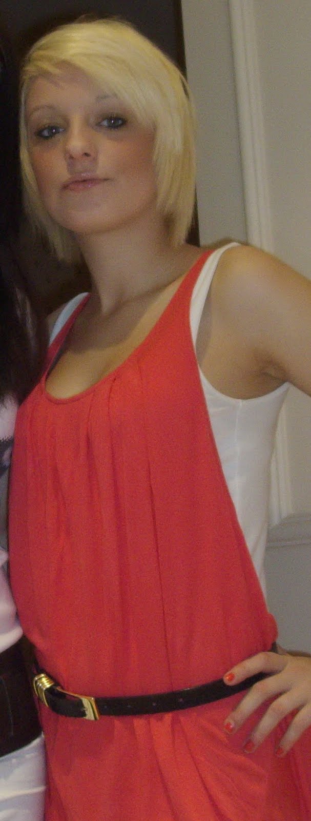
18
wearing: coat, scarf, skinny jeans, plimsoles.
I chose James Cooper to be in my music video because he was the perfect image for my target audience. It would have been also esay to change his "look" if i wanted to by a chngae of clothes/ hair style ect. He always tunred up on time which i knew he would and wasd a very reliable source for the video.

second character:
Amanda Croft
18
wearing: pink toggle coat, leggins, scarf, hat.
I chose Amanda Croft to feature in my music video becuase she was also like James Cooper a perfect image towards my target audience. Becuase Amanda was 18 it was the same as my target audience i also knew that Amanda would not let me down when i planned for us to shoot and she always turned up the the correct clothes i asked her to be in.
Third Character:
Chloe Robinson (Myself)
17
Wearing: leggins, Ugg boots, white top, cream zip up jacet with a jacket with no sleves no top.
I acted myself towards the end of the video to have a slight change of character from Amanda and James. This was not too difficult but i did have to do some test shoots and keep checking them.
Tuesday, 5 January 2010
screenplay
one girls and one boy both aged 18, dressed modern to fit target audience.
Filming starts of with extreme close ups of three different coloured eyes then the song starts with some diaglogue, after this dialogue the cast begin walking down some stairs towards the beach. It then moves on to a varied amount of establishing and weather shots which appear through out my video. Because my video was filmed on a beach it was easy to film these weather shots due to being close to the coast. I made the boy in my video write the chorus lyrics in teh sand "you dont know me" because i thought this would look very effective also it goes really well with the beat of my song due to be an up beat song.
Filming starts of with extreme close ups of three different coloured eyes then the song starts with some diaglogue, after this dialogue the cast begin walking down some stairs towards the beach. It then moves on to a varied amount of establishing and weather shots which appear through out my video. Because my video was filmed on a beach it was easy to film these weather shots due to being close to the coast. I made the boy in my video write the chorus lyrics in teh sand "you dont know me" because i thought this would look very effective also it goes really well with the beat of my song due to be an up beat song.
Prop list
characters in video will need:
To be dressed as if its a cold/windy day.
Dressed appropriate to target audience - for example, fashionable, leggins, coat ect.
Ice cream or ice lolly
Sun Glasses
Dog
Dog Lead
To be dressed as if its a cold/windy day.
Dressed appropriate to target audience - for example, fashionable, leggins, coat ect.
Ice cream or ice lolly
Sun Glasses
Dog
Dog Lead
story board ideas 2

I want to use some weather shots in my music video because i think it makes all the rest of the shots flow well and breaks them up abit. I have taken these screen shot from the music video Faunts, i looked at a few music video which included a beach scene but theere was not many to look at. Another video i analyised was Colplay Yellow which is set on a beach in liverpool. It uses weather shots but not obviously, it has a man walking up teh beach and singing tot teh lyrics and in the background you can see the weather is cleary bad and raining.
Subscribe to:
Comments (Atom)